Chapter 5 Why start with geom_point() ?
5.1 ggplot is famed for annoying errors
It’s a good idea to start with
ggplot2::geom_point()because it works for both raw and summarised data straight away. This both speeds up EDA and makes ggplot less intimidating for beginners.Let’s explore more granular data to trigger some common errors using the marriage data from the mosaicData package. We do a little data cleaning on the ceremony date and on the column that describes any previous marriages.
marriage <-
  mosaicData::Marriage %>%
  tidylog::mutate(prev_marriage = as.character(prevconc)) %>%
  tidylog::mutate(prev_marriage = case_when(
    is.na(prev_marriage) ~ "First Time",
    TRUE ~ prev_marriage
  )) %>%
  tidylog::mutate(ceremonydate1 = lubridate::parse_date_time(ceremonydate, "mdy"))
## mutate: new variable 'prev_marriage' with 3 unique values and 49% NA## mutate: changed 48 values (49%) of 'prev_marriage' (48 fewer NA)## mutate: new variable 'ceremonydate1' with 49 unique values and 0% NAkableExtra::kable(utils::head(marriage %>%
dplyr::select(ceremonydate1, person, prev_marriage, age, race, sign)))| ceremonydate1 | person | prev_marriage | age | race | sign |
|---|---|---|---|---|---|
| 1996-11-09 | Groom | First Time | 32.60274 | White | Aries |
| 1996-11-12 | Groom | Divorce | 32.29041 | White | Leo |
| 1996-11-27 | Groom | Divorce | 34.79178 | Hispanic | Pisces |
| 1996-12-07 | Groom | Divorce | 40.57808 | Black | Gemini |
| 1996-12-14 | Groom | First Time | 30.02192 | White | Saggitarius |
| 1996-12-26 | Groom | First Time | 26.86301 | White | Pisces |
In the Texas housing sales data, geom_line works because we have only one value of sales per city and date used in the “aesthetics” of the plot (e.g. x,y, colour, category, or facet being the most common aesthetics).
A common way to trigger ggplot2 errors (or create confusing plots) is to use bar and line charts before the data is summarised. For example, a line chart is inappropriate with many ages per previous marriage status in the data.
- Changing the plot above to a bar chart instead returns a confusing error.
## Error: stat_count() must not be used with a y aesthetic.
ggplot2::geom_col()orggplot2::geom_bar(stat = "identity")will plot the data for us without and error but it’s showing the sum of all the ages in each previous marriage category which doesn’t tell us an interesting story in the data.
marriage %>%
  ggplot2::ggplot() +
  ggplot2::aes(
    x = prev_marriage,
    y = age
  ) +
  ggplot2::geom_bar(stat = "identity")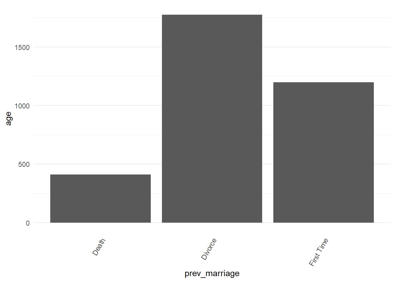
Another reason to avoid starting EDA with bars is they may perform a statistical transformation without us realising. As explained in the Statistical Transformations chapter of R for Data Science.
A bar or line may end up being the final plot choice, but for fast EDA let’s avoid them and retreat to our friend
ggplot2::geom_point()
5.2 Retreat to geom_point()
- Let’s go back to using
ggplot2::geom_point()and facet by person.
marriage %>%
  ggplot2::ggplot() +
  ggplot2::aes(
    x = prev_marriage,
    y = age
  ) +
  ggplot2::facet_wrap(~person) +
  ggplot2::geom_point(alpha = 0.3)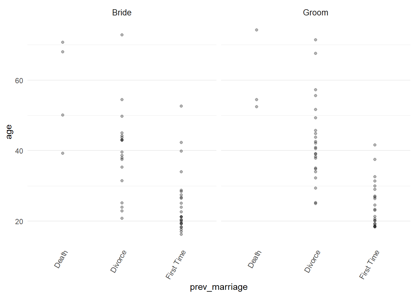
Immediately this is the start of an interesting story we can follow. We see the ages of brides and grooms shown by whether they are getting married for the first time or if they have been divorced or widowed.
As well as data points we might also experiment with different ways of showing these distributions. Hadley Wickham’s ggplot2: Elegant Graphics for Data Analysis has a good short chapter on displaying distributions.
First let’s try a histogram and see if this helps us tell a good story.
marriage %>%
  ggplot2::ggplot() +
  ggplot2::aes(x = age) +
  ggplot2::facet_wrap(~ person +
                        prev_marriage) +
  ggplot2::geom_histogram()
## `stat_bin()` using `bins = 30`. Pick better value with `binwidth`.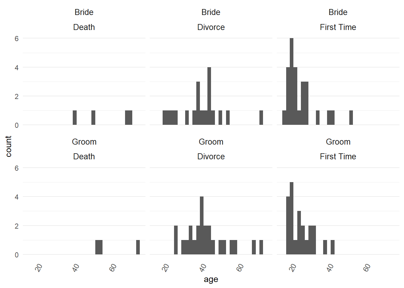
- We get a warning about the bin width. We can set the bin width by hand, say 6 bins.
marriage %>%
  ggplot2::ggplot() +
  ggplot2::aes(x = age) +
  ggplot2::facet_wrap(~ person +
                        prev_marriage) +
  ggplot2::geom_histogram(bins = "6")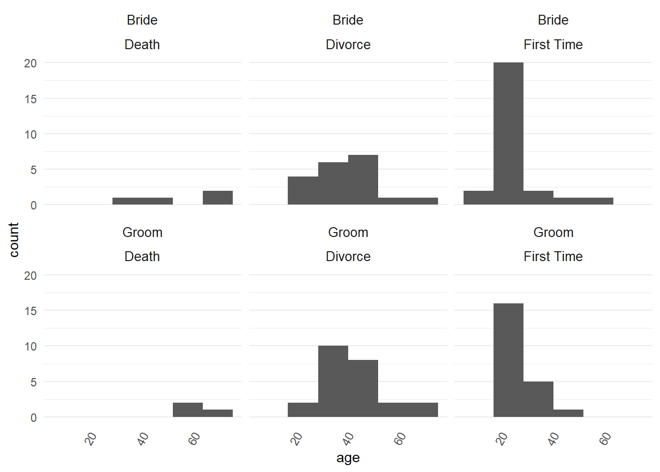
This looks better but is there an optimum bin number? There is probably no optimum width, as discussed in this stackexchange question.
Let’s also try a density distribution plot using
ggplot2::geom_density()
p <-
  marriage %>%
  ggplot2::ggplot() +
  ggplot2::aes(
    x = age,
    fill = prev_marriage
  ) +
  ggplot2::geom_density(adjust = 1,
                        alpha = 0.5,
                        colour = NA) +
  ggplot2::facet_wrap(vars(person),
                      ncol = 1) +
  ggplot2::theme_minimal()

directlabels::direct.label(p, list("top.points", cex = .75, hjust = 0, vjust = -0.2))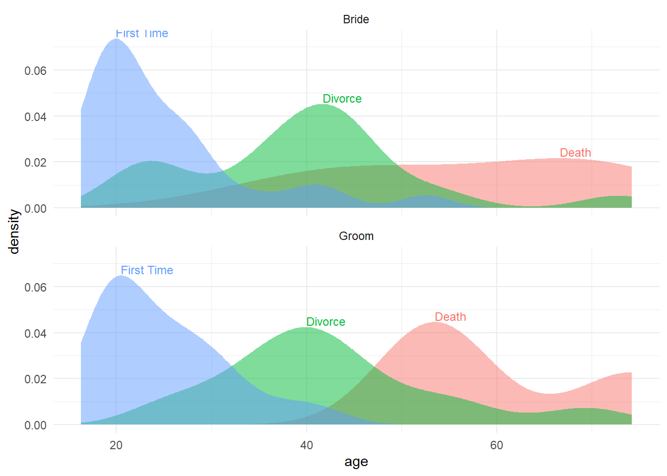
5.3 geom_jitter() and geom_boxplot() is better
- But with so few data points I think that
ggplot2::box_plot()with the data points overlaid usingggplot2::geom_jitter()tells the data story well.
marriage %>%
  ggplot2::ggplot() +
  ggplot2::aes(
    x = prev_marriage,
    y = age
  ) +
  ggplot2::facet_wrap(~person) +
  ggplot2::geom_boxplot(alpha = 0.8) +
  ggplot2::geom_jitter(width = 0.1,
                       alpha = 0.3) +
  ggplot2::theme_light()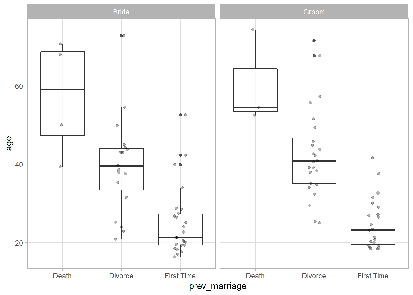
5.4 Final choice: geom_dotplot() and stat_summary()
The plot above would have been my final choice until I saw the fantastic “evolution of a ggplot” post by Cedric Sherer.
In the gif below you can see Sherer also starts with a boxplot, but his final choice is
ggplot2::geom_jitter()andggplot2::stat_summary(). His post gives the full code in a gradual code story presented like the ggplot flip-books.
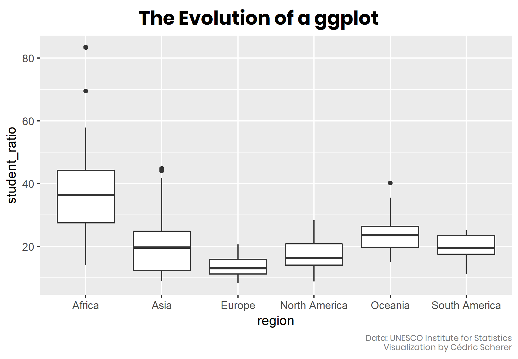
- And here is his final plot shown at the end of the looping gif above.
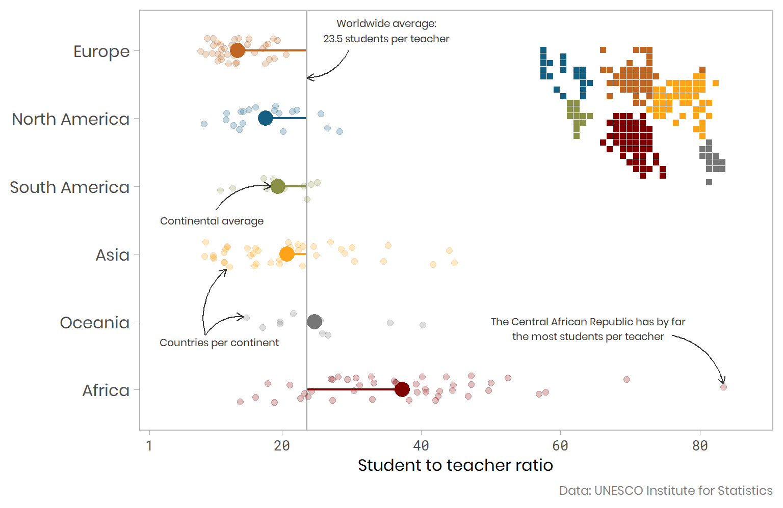
- Inspired by that plot and its code I prefer my final plot below on the marriage data. It is more engaging than a boxplot as it tells the story with little or no explanation needed. Much like a plot in a quality online newspaper can. I have also used
ggplot2::geom_dotplot()instead ofggplot2::geom_jitter(). The dot plot lines up dots that very close in value. I found this geom_dotplot tutorial helpful to understand how to use it and control how the dots are lined up using the binwidth argument.

p <- marriage %>%
  dplyr::group_by(person,prev_marriage) %>%
  dplyr::mutate(pers_prev_avg = median(age)) %>%
  dplyr::ungroup() %>%
  dplyr::group_by(person) %>%
  dplyr::mutate(pers_avg = median(age)) %>%
  dplyr::ungroup() %>%
  ggplot2::ggplot() +
  ggplot2::aes(
    x = prev_marriage,
    y = age,
    fill = prev_marriage,
    colour = prev_marriage,
  ) +
  ggplot2::facet_wrap(~person, ncol = 1) +
  ggplot2::stat_summary(fun.y = median,
                        geom = "point",
                        size = 4,
                        alpha = 0.8) +
  ggplot2::stat_summary(aes(label= paste( round(..y..,1),
                                          " years")),
                        fun.y=median,
                        colour = "black",
                        geom="text",
                        size=3,
                        vjust = -1.5) +
  ggplot2::geom_hline(aes(yintercept = pers_avg),
                     color = "gray70",
                     size = 0.6) +
  ggplot2::geom_text(aes(x = 0.7,
                         y = pers_avg,
                         label = paste(person," average age", round(pers_avg,0)),
                         hjust = 1.05),
                     colour = "black",
                     size = 3) +
  ggplot2::geom_segment(aes(x = prev_marriage,
                   xend = prev_marriage,
                   y = pers_avg,
                   yend = pers_prev_avg),
               size = 0.8) +
  ggplot2::geom_dotplot(binaxis = "y",
                        dotsize = 1,
                        method = "dotdensity",
                        binwidth =  0.5,
                        alpha = 0.4,
                        stackdir = "center",
                        stackratio = 1.5) +
  ggplot2::scale_color_brewer(type = "qual",
                              palette = "Dark2") +
  ggplot2::scale_fill_brewer(type = "qual",
                              palette = "Dark2") +
  ggplot2::theme_minimal() +
  ggplot2::theme(
                 plot.title = element_text(size = 14,
                                           hjust = 0),
                 legend.position = "none",
                 axis.title.x = element_blank(),
                 axis.title.y = element_blank(),
                 panel.grid = element_blank(),
                 strip.text.x = element_text(size = 12,
                                             hjust = 0.1),
                 panel.border = element_rect(colour = "black",
                                             fill=NA,
                                             size = 0.1)
                 ) +
  ggplot2::scale_y_continuous(breaks=base::seq(0,100,10)) +
  ggplot2::coord_flip() +
    ggplot2::labs(
    title = "Age* of brides and grooms by previous marriage status",
    caption = "*The average ages are the median, the middle age among all ages.\n i.e. 50% of ages fall below the median value and 50% above it"
  )

ggplot2::ggsave(file="marriage.svg",
                device = "svg",
                plot=p)
## Saving 7 x 5 in imageIn the plot above we can see grooms are older on average overall. But do they tend to be older or younger than their bride within each marriage?
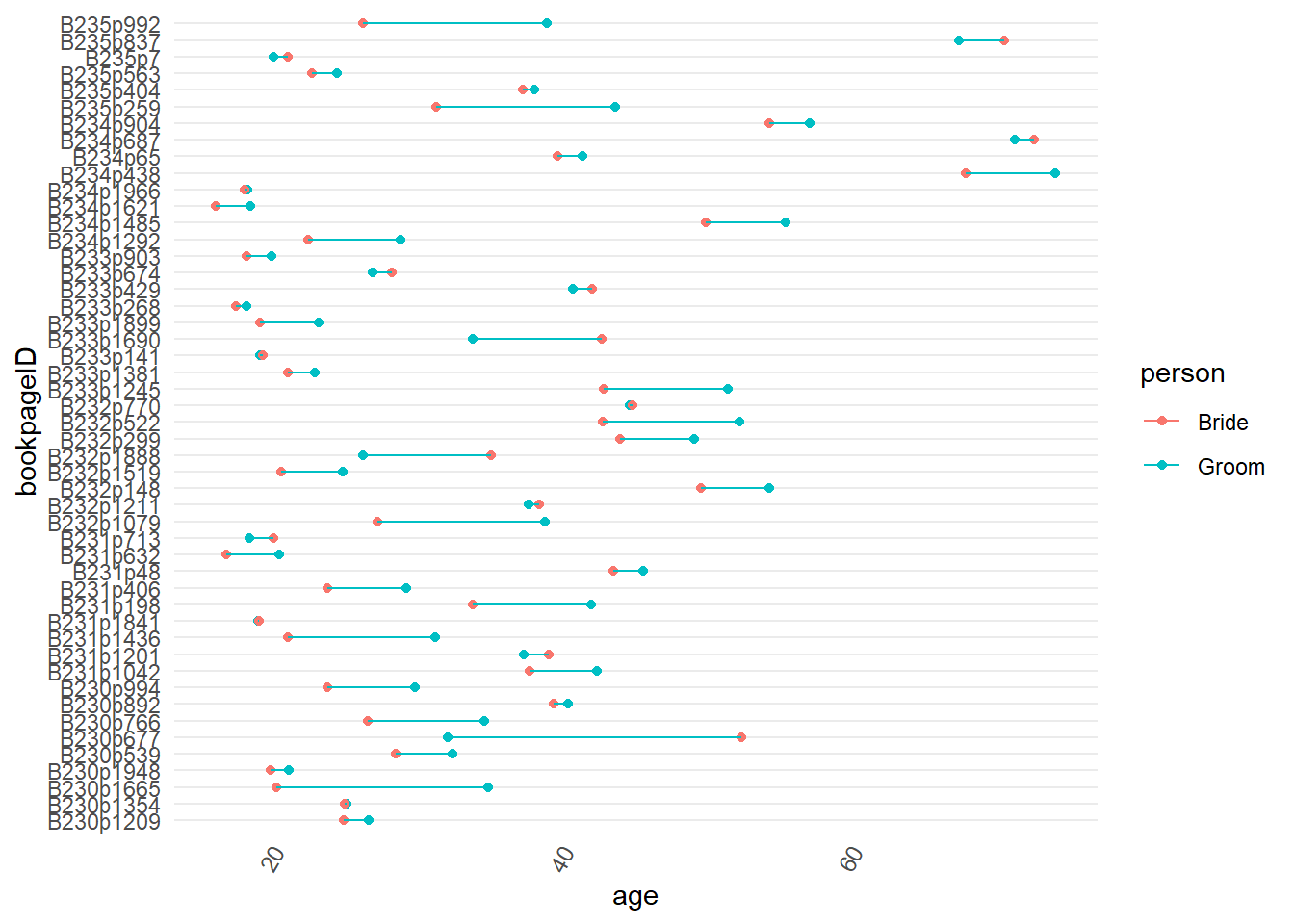
As a final quick exploratory chart let’s put the ceremony ID on the x-axis, use
ggplot2::geom_point()for age, and give the data points for brides and grooms their own colour. Adding the ceremony IDbookpageIDto the group aesthetic means that when we addggplot2::geom_line()this creates a line that joins the two data points for each marriage.We can see that most grooms are older than most brides in each ceremony.
marriage %>%
  ggplot2::ggplot() +
  ggplot2::aes(x = bookpageID,
               y = age,
               colour = person,
               group = bookpageID) +
  ggplot2::geom_point() +
  ggplot2::geom_line() +
    ggplot2::coord_flip()