Chapter 4 Exploratory Data Analysis
4.1 Start with dplyr counts and summaries in console
In his Tidy Tuesday live coding videos, David Robinson usually starts exploring new data with
dplyr::count()in the console. I recommend this as the first step in your EDA.In the code below we don’t use the package name in the console (so breaking rule 1 I just told you). We don’t need the package name as we won’t save this code for others to read. This means we can type more quickly to explore the data with dplyr verbs faster.
df %>% count(city) %>% View()

df %>% count(city, year, month) %>% View()#

df %>% group_by(city) %>% summarise(vol_max = max(volume, na.rm = T)) %>% arrange(desc(vol_max)) %>% View()
4.2 Plot data points with geom_point()
After using
dplyr::count(),dplyr::group_by()anddplyr::summarise(), try plotting the data points withggplot2::geom_point(). It almost NEVER fails to show you what’s going on quickly. And it is unlikely to return a confusing ggplot error message.ggplot2::geom_point()is the minimum and most reliable ggplot plot type (or geom) to start visualising data. Increasingly, I’m findingggpplot2::geom_point()is often a good choice to include in the final pot too.Let’s look at all the values of sales for each date.
## Warning: Removed 568 rows containing missing values (geom_point).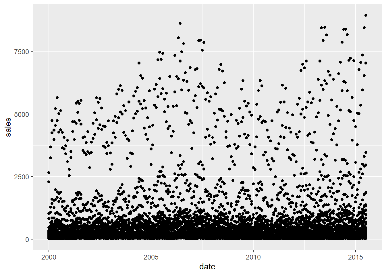
- Now let’s look at the individual sales values for each city.
## Warning: Removed 568 rows containing missing values (geom_point).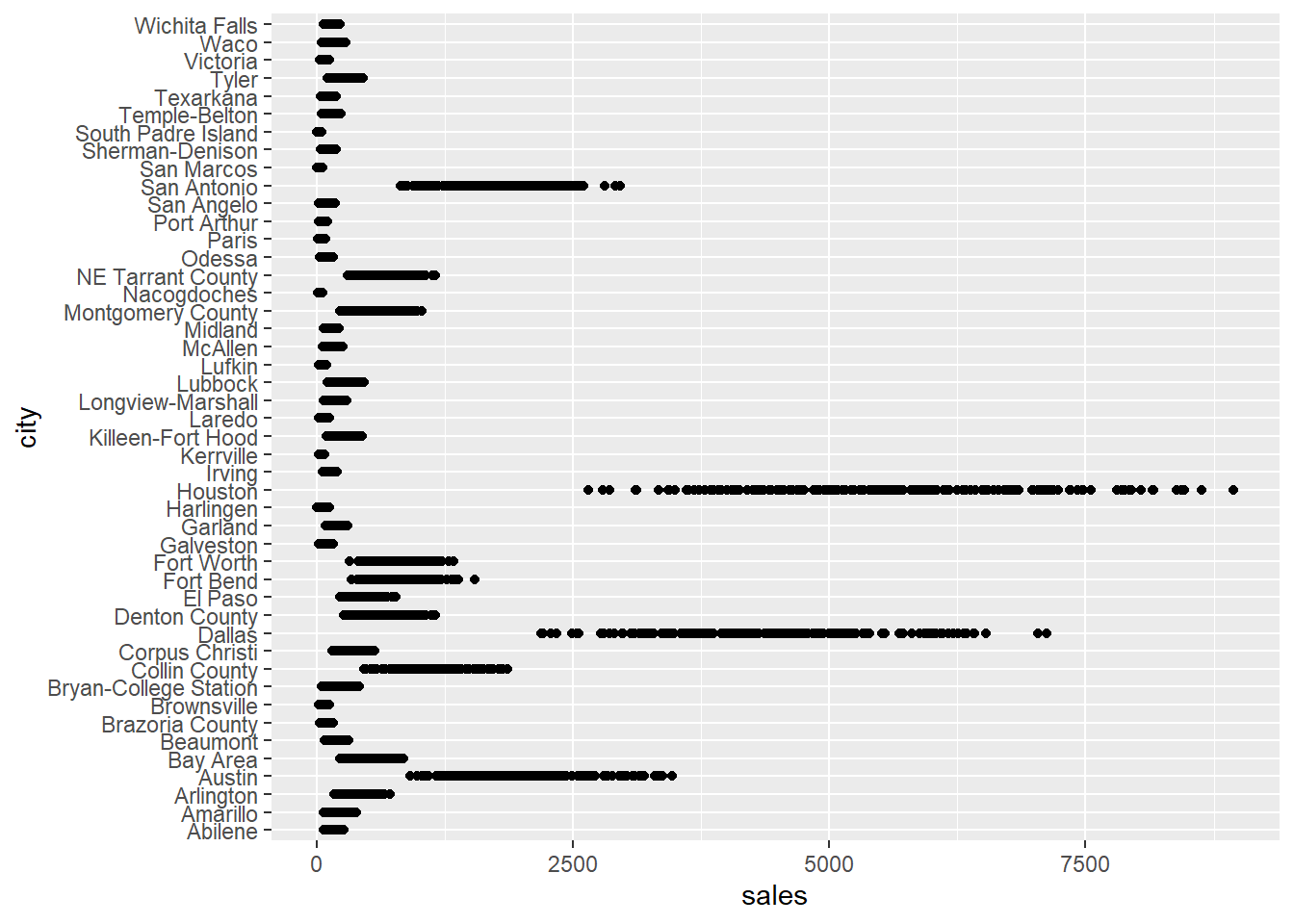
With so many data points to plot they overlap to create thick dark lines that might hide interesting variation. This is known as overplotting. Reduce over plotting by replacing
ggplot2::geom_point()withggplot2::geom_jitter(). It randomly jitters the location of the data points by a small amount so that fewer points overlap.Sometimes there are so many data points that jittering does not reduce overplotting enough. You can also make the data points lighter using the
alphaargument ofggplot2::geom_jitter()as in the code below. The lower the value ofalphathe fainter the points.
## Warning: Removed 568 rows containing missing values (geom_point).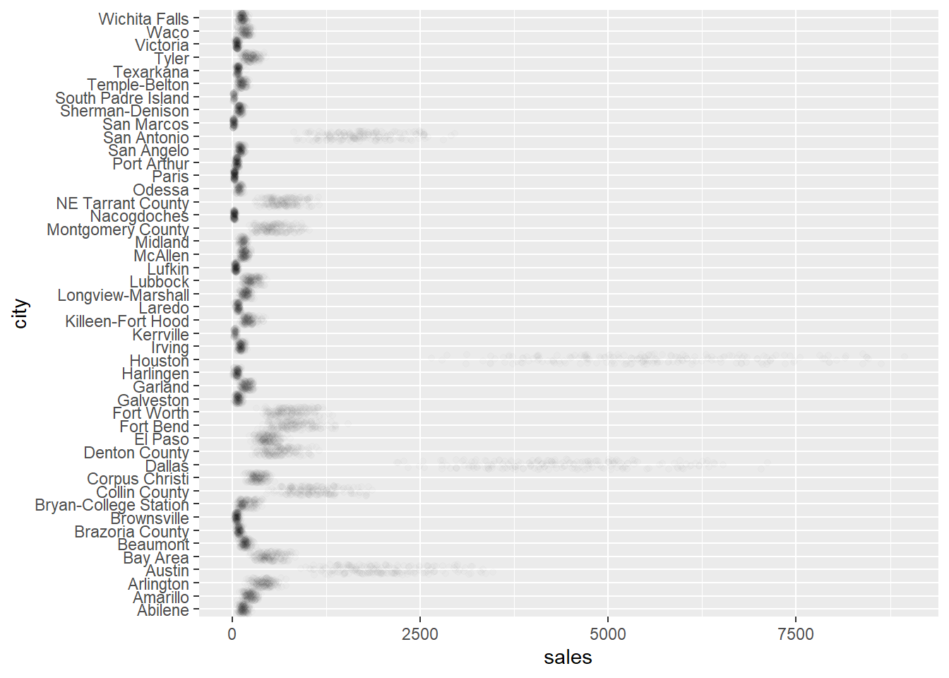
Hadley Wickham has a few more tricks you can use in the free to access overplotting chapter of his ggplot2: Elegant Graphics for Data Analysis book.
We all know sales of most things vary by the time of year. So let’s now put date on the x-axis, make city the colour, and because the data is over time we can join the data points by using
ggplot2::geom_line().We also use the reduced dataframe with fewer cities to create a less crowded plot.
df_red %>%
  ggplot2::ggplot() +
  ggplot2::aes(
    x = date,
    y = sales,
    colour = city
  ) +
  ggplot2::geom_line()
## Warning: Removed 1 rows containing missing values (geom_path).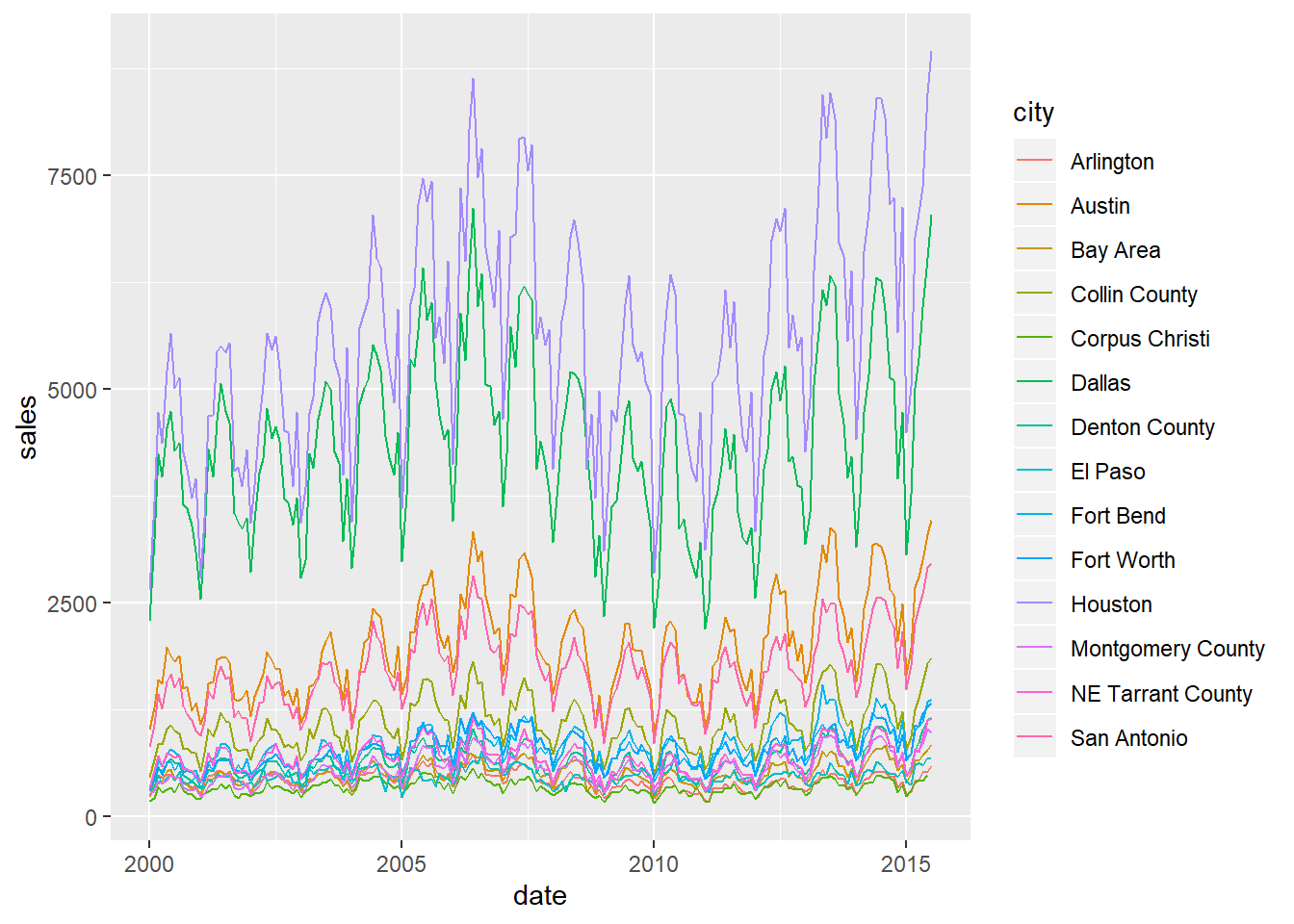
Beautiful. While sales have very different volumes between cities, we can see they all follow a similar same seasonal pattern. To bring the trends of sales closer to each other so that they are easier to compare, we can transform the sales value by showing the log of sales. This is Hadley Wickham’s approach in ggplot2: Elegant Graphics for Data Analysis.
Wickham goes on to model the Texas housing sales data by fitting a linear model between the log of sales and the month. He then plots the residuals (i.e. the change in sales not explained by the month) to remove the strong seasonal effects, similar to decomposition in a classic time series analysis. Take a look at the new fable forecasting package for another way to decompose a time series.
We take a visual approach to reduce the seasonal effect in the final Polish your final plot part of this chapter. We plot the entire time series with years marked so that you can easily see the strong repeating monthly sales pattern.
df_red %>%
  ggplot2::ggplot() +
  ggplot2::aes(
    x = date,
    y = base::log(sales),
    colour = city
  ) +
  ggplot2::geom_line()
## Warning: Removed 1 rows containing missing values (geom_path).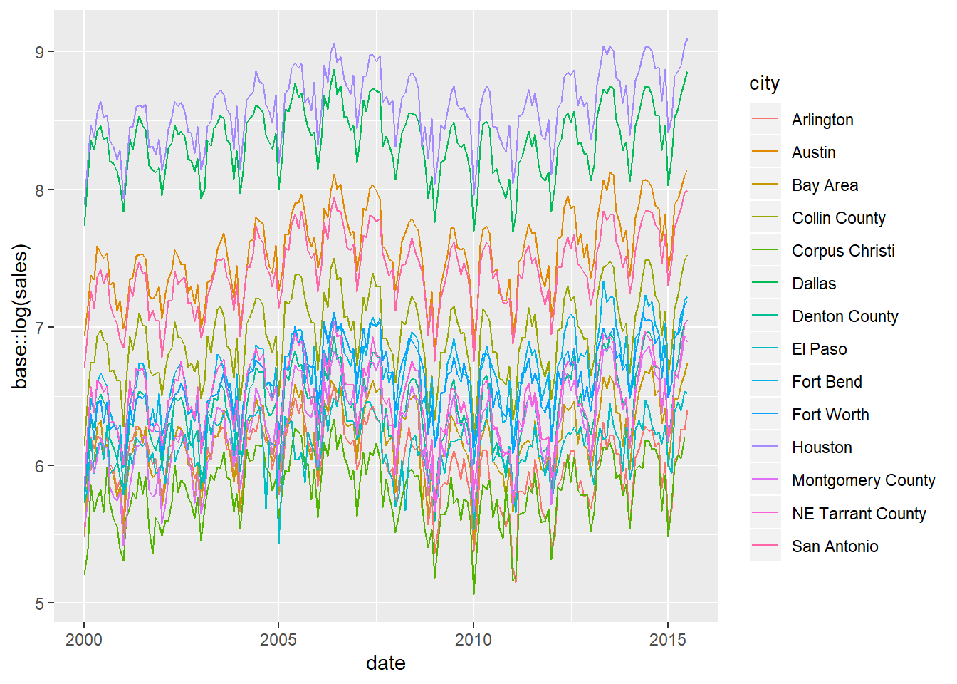
4.3 Facet by categories
So far we have shown the different sales patterns for each city by putting city into the
colourargument of ggplot. However, with lots of cities, the plot gets too crowded. When you have many categories to compare like this, then facets or “small multiples” are the right choice. In other words, draw a chart for each value in one or more columns then look at all the plots at once, usually in a grid.Also, consider setting the
scalesargument of the facet to"free"like thisscales = "free". Each plot will then have its scale set to the maximum of each city’s sales. It lets us more easily spot interesting differences or similarities in the patterns over time between each city.
df_red %>%
  ggplot2::ggplot() +
  ggplot2::aes(
    x = date,
    y = sales,
    colour = city
  ) +
  ggplot2::geom_line() +
  ggplot2::facet_wrap(~city,
    scales = "free"
  )
## Warning: Removed 1 rows containing missing values (geom_path).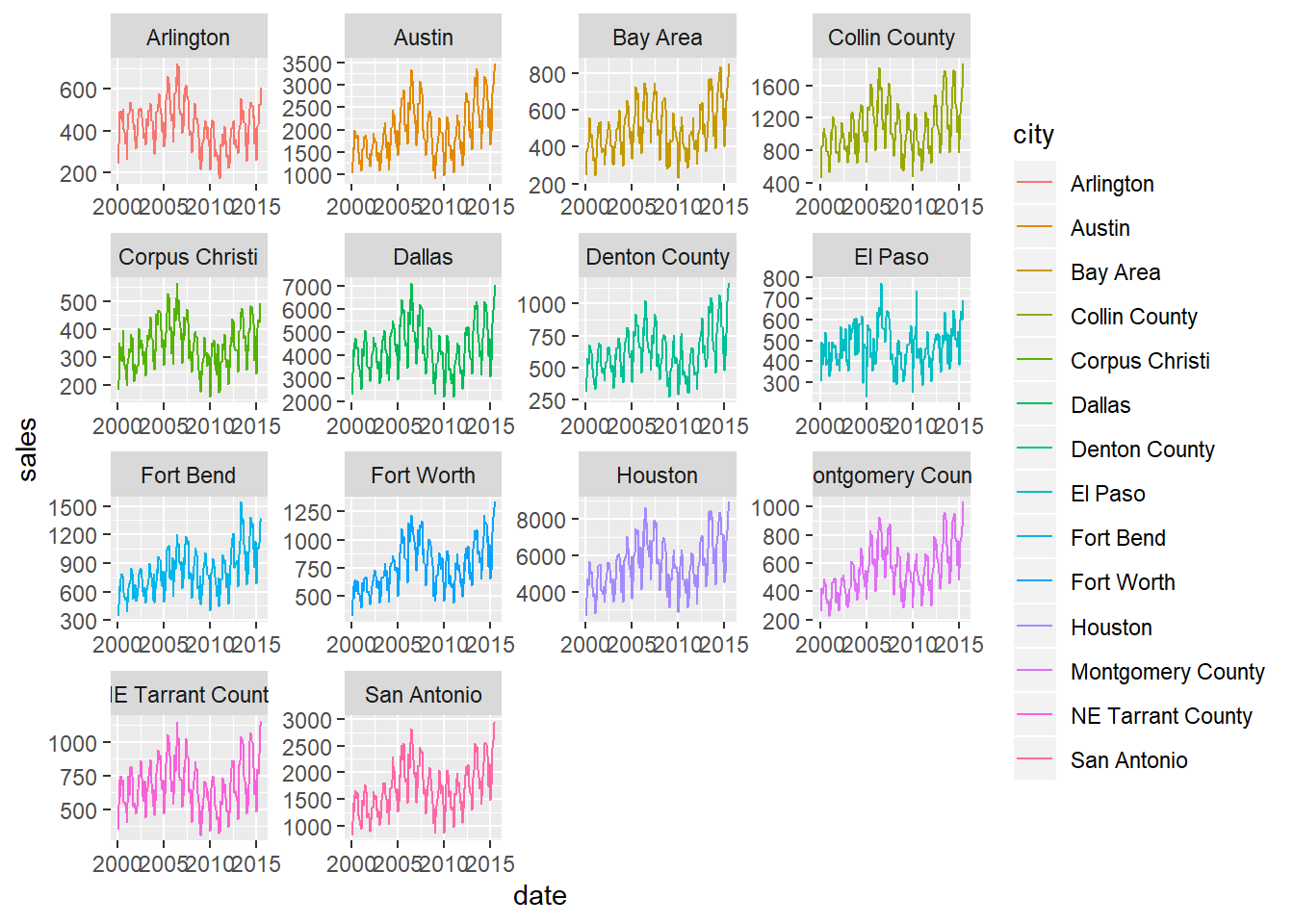
4.4 Facet interactively (trelliscopejs)
- You can also facet and explore your data interactively with a GUI using trelliscopejs piped onto the end of your ggplot. Below we facet all the Texas cities in a trelliscopejs web page. Have a play with all the settings in the chart below to see what it does.
4.5 Loop to plot every category separately
To study each city as a full single chart on its own we can loop through the cities and plot them automatically with very little code.
To do this we “nest” a dataframe for each city into one dataframe. Then loop through each of the nested city dataframes, creating a plot for each one.
Here we use
dplyr::group_by()on city, then usetidyr::nest()to create the individual nested dataframes.
- If we pipe the nested dataframe
df_red_nestintoView()this lets us see the individual dataframes contained within thedatacolumn thattidyr::nest()has created.
- We can also view one of the nested data frames using square brackets. Think of the numbers in the square brackets like the coordinates in Excel. The first number is the column position, and the second number is the row position. In the example below we view the second column along of the nested dataframe
[[2]]and the first row of that column[[1]].
- Once you start to get comfortable with how square brackets work, it is a powerful way to navigate through nested R objects. The code above showed us the data in the first nested data frame of one city. The code below now drills down into the first column and first row of that single nested dataframe. This is just one cell, so is the most granular drill down possible for the object
df_red_nest.
- We can now add a plot to each nested data frame for each city. We use
purrr::map2(). This purr function is a compact way to loop through two arguments in another function. The function arguments ofggplot2::ggplot()being set bypurrr::map2()are the.xand.yvalues. They are the nested dataframes in thedatacolumn, and the city names inside thecitycolumn of the nested dataframedf_red_nestrespectively.
df_red_nest <-
  df_red_nest %>%
  dplyr::mutate(plot = purrr::map2(.x = data,
                                   .y = city,
                                   ~ ggplot2::ggplot(data = .x,
                                                     aes(x = date,
                                                         y = sales)) +
                                     ggtitle(glue::glue("Plot of {.y}")) +
geom_line()))- Take a look at the new nested data frame with a new column added containing a plot for each city.
- Let’s also look at the information held for one of the plots, again using values in square brackets. The code below shows you that the plot is a series of nested lists that describe every element of the plot.
- Finally, let’s print every plot with this simple code.
Show all the looped prints
## [[1]]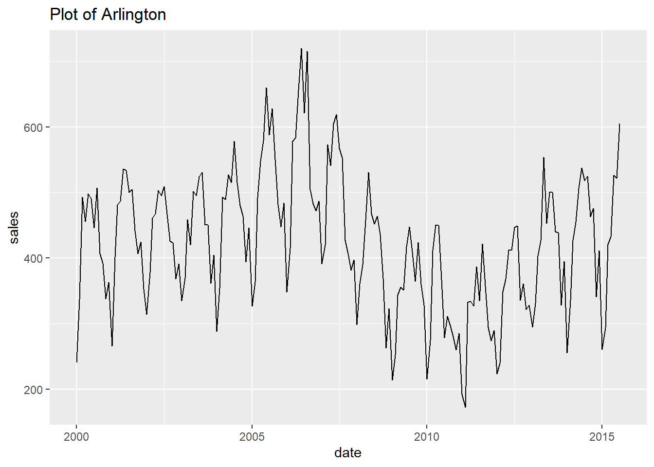
##
## [[2]]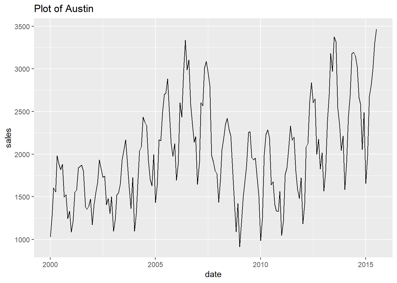
##
## [[3]]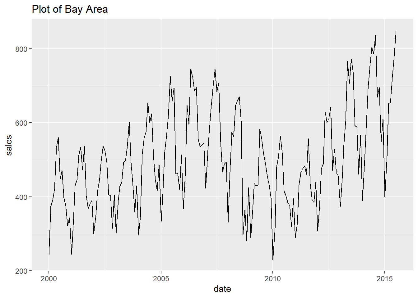
##
## [[4]]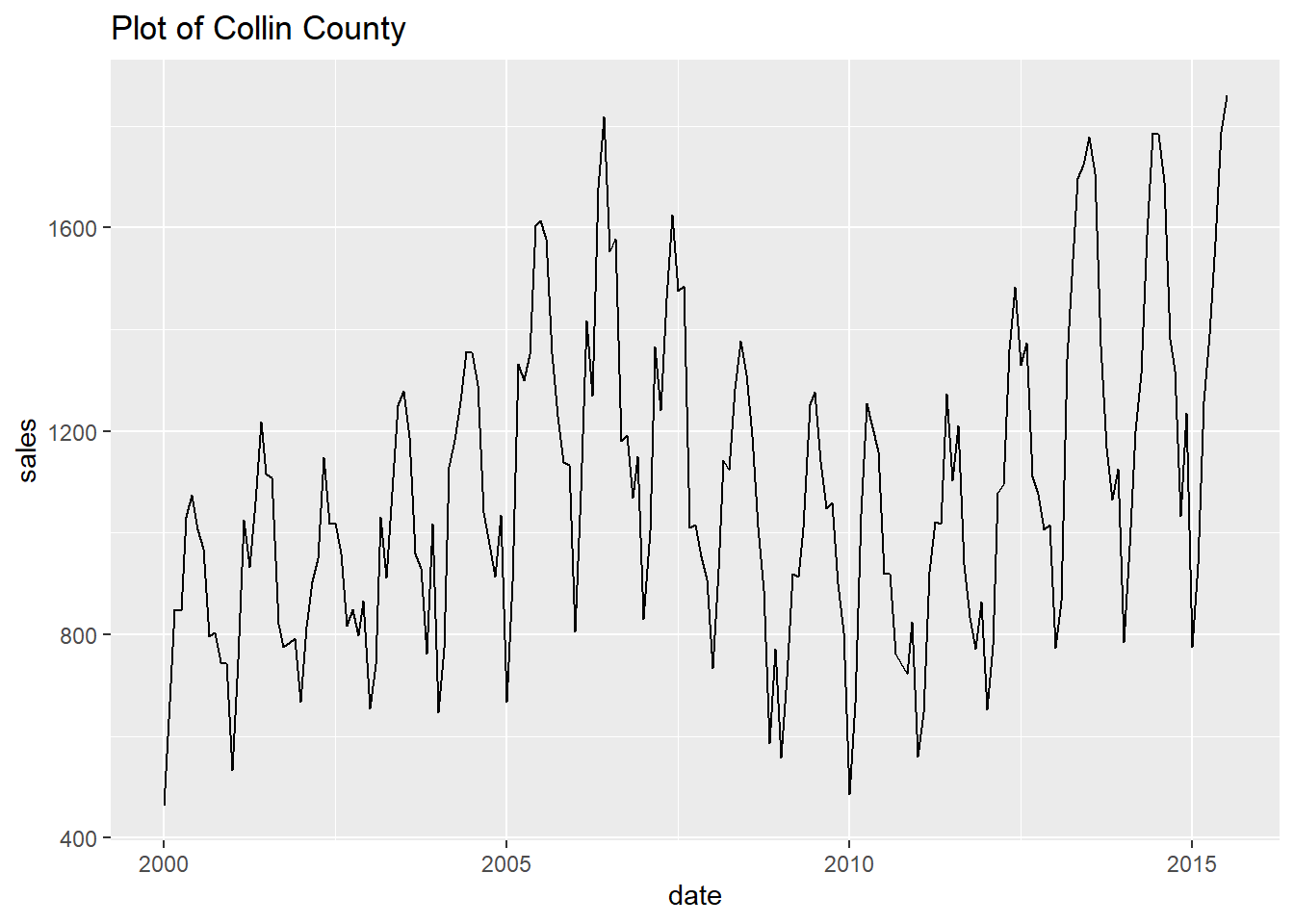
##
## [[5]]
## Warning: Removed 1 rows containing missing values (geom_path).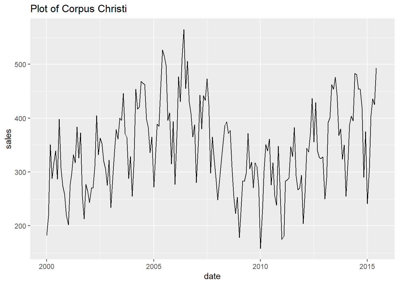
##
## [[6]]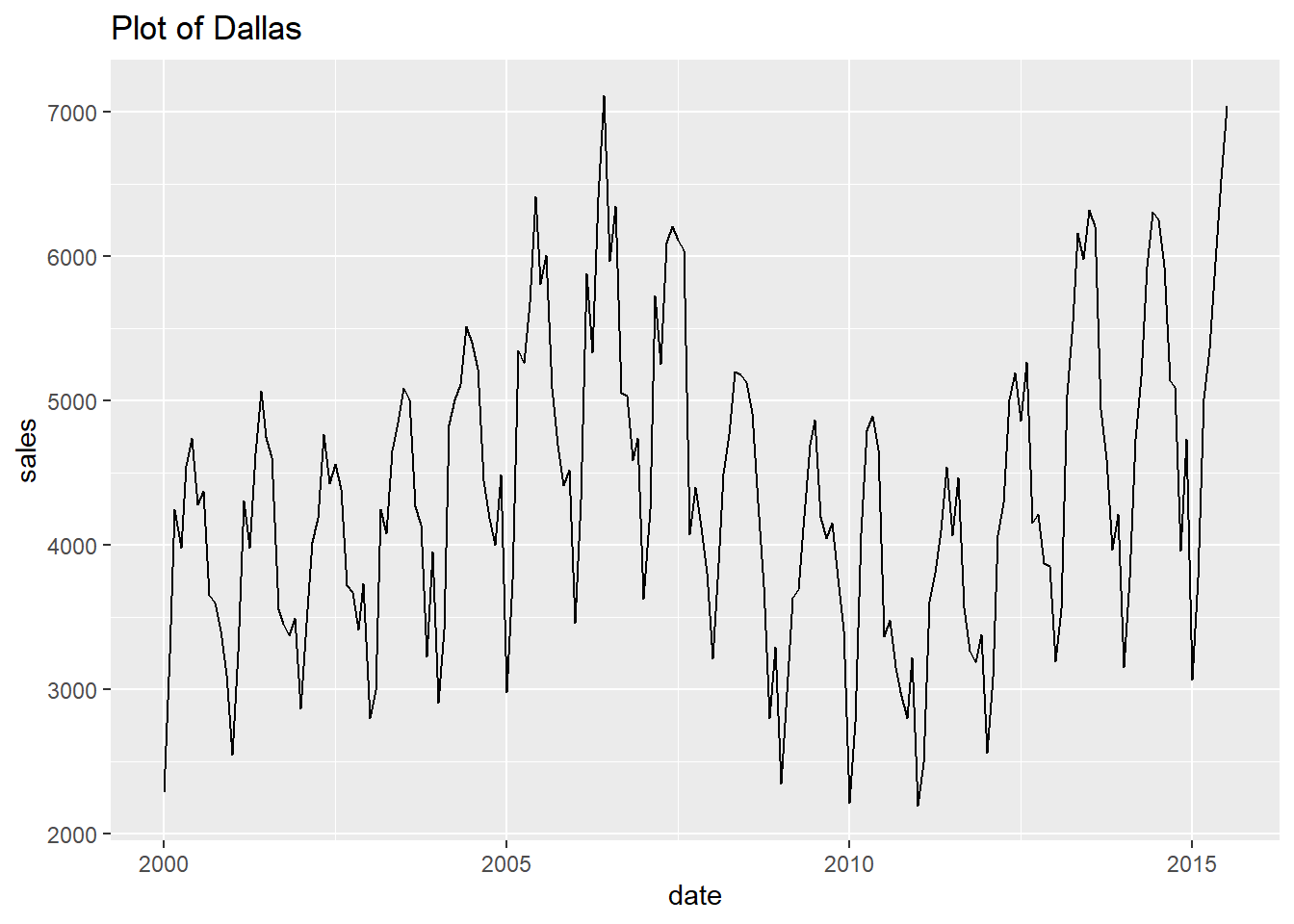
##
## [[7]]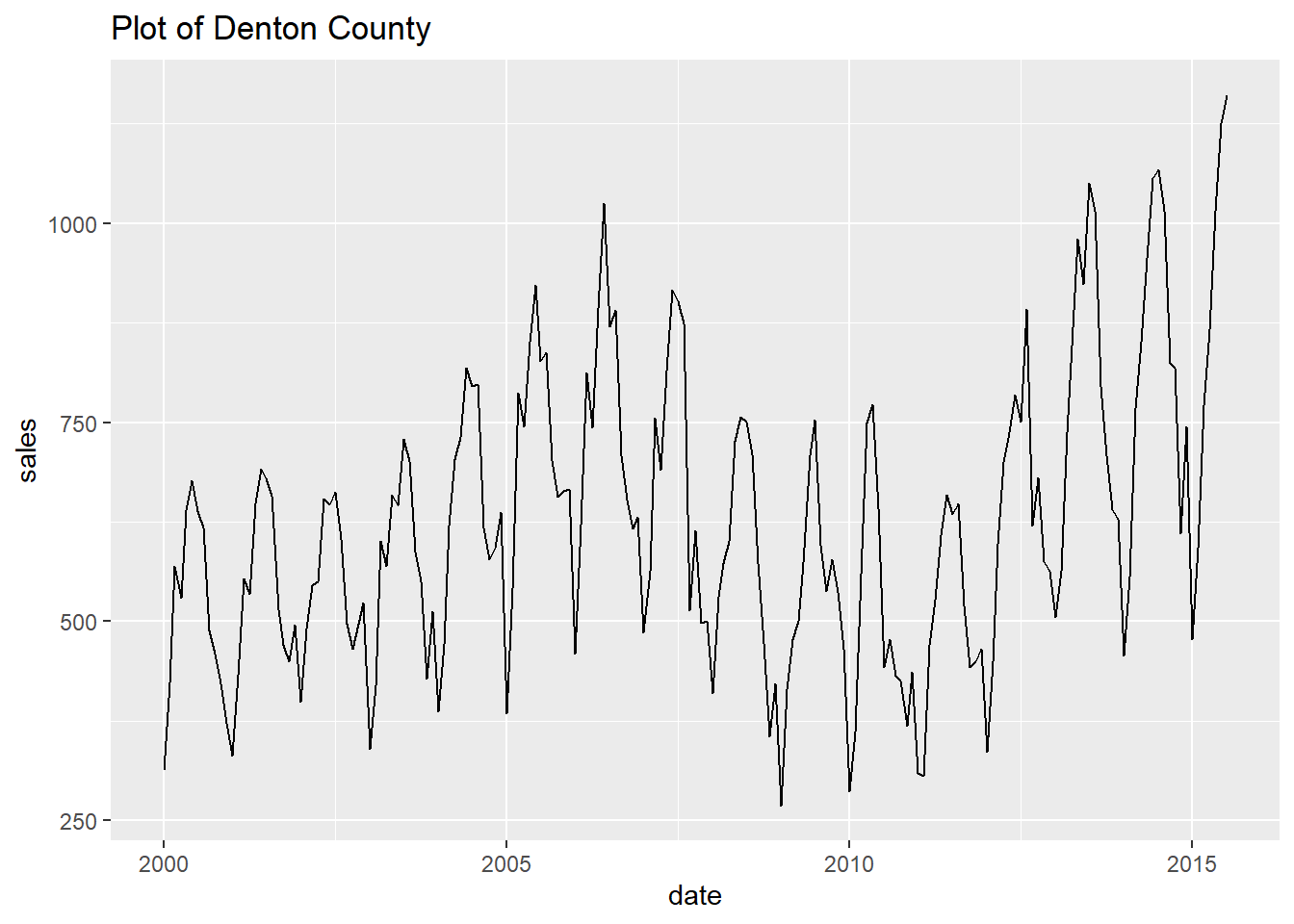
##
## [[8]]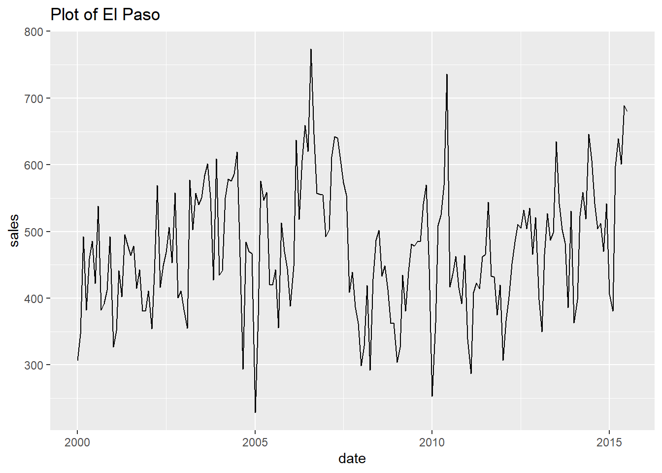
##
## [[9]]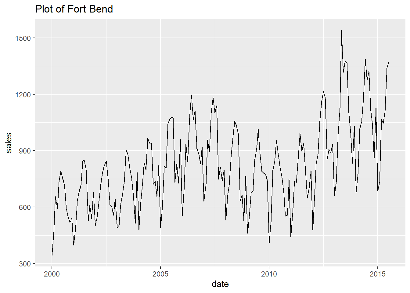
##
## [[10]]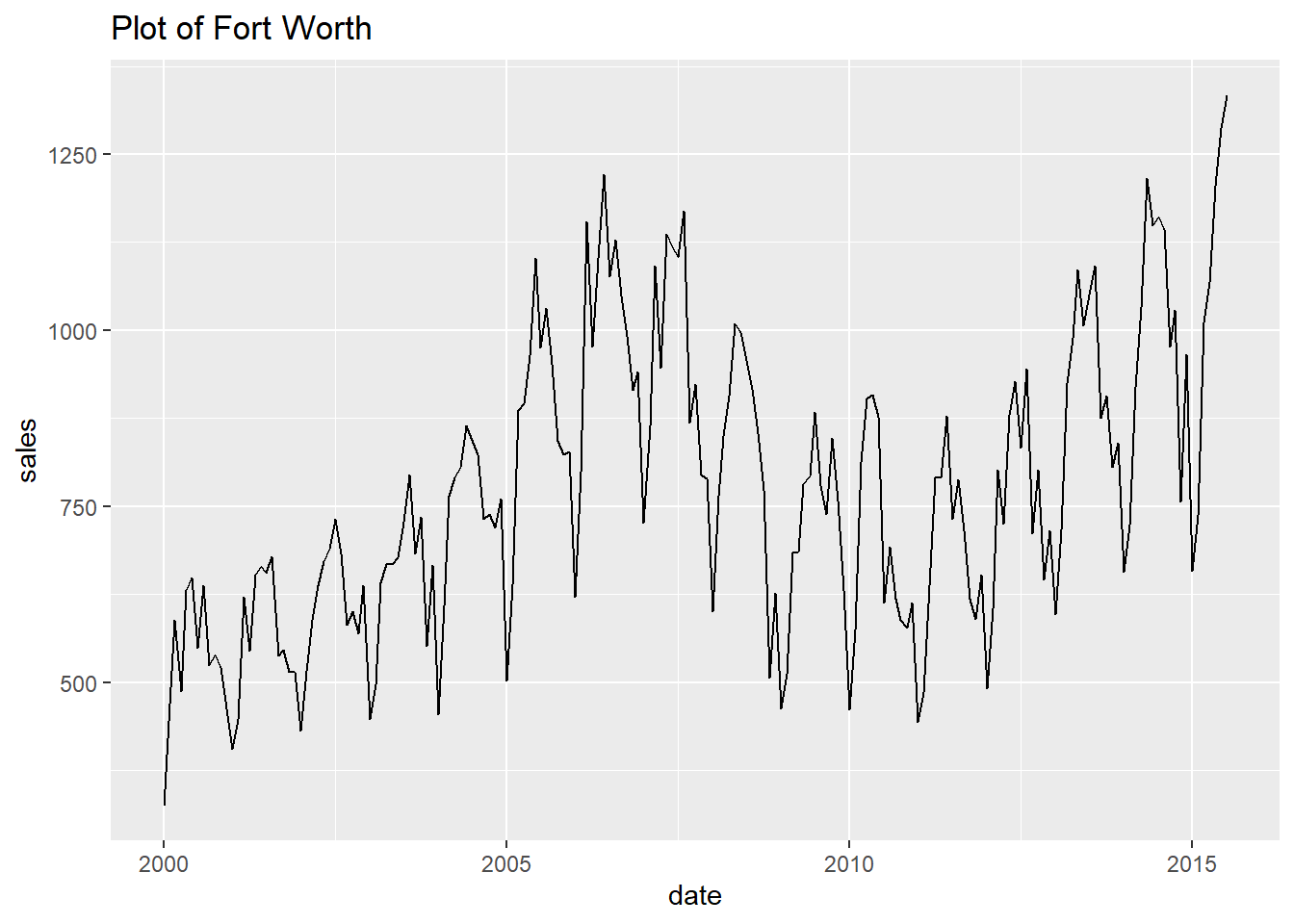
##
## [[11]]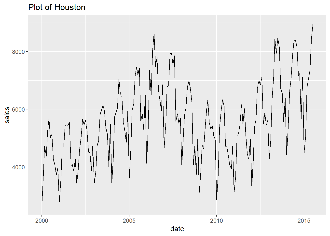
##
## [[12]]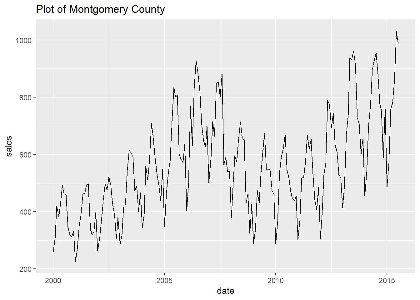
##
## [[13]]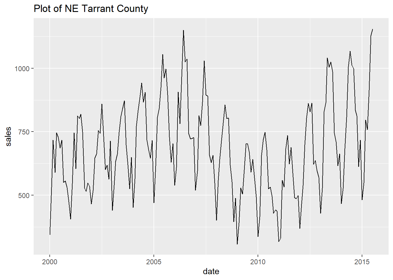
##
## [[14]]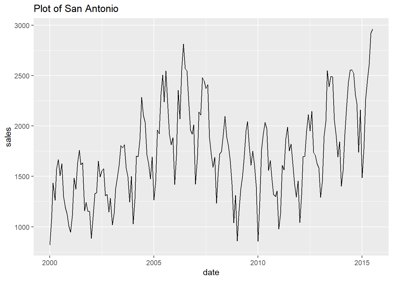
4.6 Polish your final plot
We now have a bare minimum Exploratory Data Analysis toolkit. We explore the data with
dplyr::count()from the console then visualise it withggplot2::geom_point().From exploring the data quickly we are soon ready to select a plot that tells a compelling story. But adding all the bells and whistles to make the final plot for a customer or publication can and does take a long time. So this polish shouldn’t be part of your exploratory data analysis.
Also, make sure your polished plot code follows the Code style recommended earlier. You will find it quicker to comment out or tweak specific parts of your plot code until it looks just right. Clean code is faster to iterate.
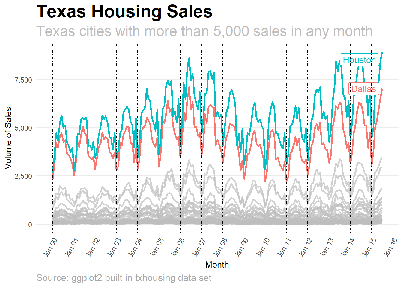
The plot below isn’t perfect. There may be things you want to change depending both on what story you want to tell and your style.
How did I write this code? By Googling for what I wanted to do (e.g. “ggplot remove axis grid lines”), copying the code from a stackoverflow answer, then pasting the code into a clear structure as below.
Many of the tweaks or polish will be to
ggplot2::theme()orggplot2::scale()but are you really going to remember the ggplot code you need for every adjustment you want to make? I no longer worry about remembering how to do it and focus on how I want it to look and get absorbed in the creation and satisfaction of the plot gradually improving.After you have built a few of your publication-quality pots with clear code, you will soon be using your plot code as a store of examples to re-use meaning that you will Google less.
Be prepared for this code tweaking and plot polishing to take longer than you planned. Always.

# a list of dates to add vertical lines to the plot
years <- base::seq.Date(
  from = as.Date("2000-01-01"),
  to = as.Date("2015-01-01"),
  by = "years"
)

p <- df %>%
  ggplot2::ggplot() +
  ggplot2::aes(
    x = date,
    y = sales,
    colour = city
  ) +
  ggplot2::geom_line(size = 1) +
  gghighlight::gghighlight(base::max(sales) > 5000, # highlight only cities with higher sales
    label_params = list(size = 4)
  ) +
  ggplot2::scale_y_continuous(labels = scales::comma) +
  ggplot2::scale_x_date(
    date_breaks = "1 year",
    labels = scales::date_format("%b %y"),
    limits = c(
      as.Date("2000-01-01"),
      as.Date("2015-07-01")
    )
  ) +
  ggplot2::labs(
    title = "Texas Housing Sales",
    subtitle = "Texas cities with more than 5,000 sales in any month",
    caption = "Source: ggplot2 built in txhousing data set",
    x = "Month",
    y = "Volume of Sales"
  ) +
  ggplot2::geom_vline(
    xintercept = years,
    linetype = 4
  ) +
  ggplot2::theme_minimal() +
  ggplot2::theme(
    panel.grid.major.x = element_blank(),
    panel.grid.minor.x = element_blank(),
    strip.text.x = element_text(size = 10),
    axis.text.x = element_text(
      angle = 60,
      hjust = 1,
      size = 9
    ),
    plot.title = element_text(
      size = 22,
      face = "bold"
    ),
    plot.subtitle = element_text(
      color = "grey",
      size = 18
    ),
    plot.caption = element_text(
      hjust = 0,
      size = 12,
      color = "darkgrey"
    ),
  )
## label_key: city## Saving 7 x 5 in image## Warning: Removed 430 rows containing missing values (geom_path).4.7 Simplify plot theme settings
- If we’re happy with the font sizes and other theme settings in our final plot we will want further plots to look the same. We can so this with less code by creating our own theme then setting that as the default using
ggplot2::theme_set(). Defining the plot theme settings separately will make our plot code shorter and so easier to read. Below we put all the plot theme settings from the final plot above intomy_themethen set that as the default.
my_theme <-
  ggplot2::theme_minimal() +
  ggplot2::theme(
    panel.grid.major.x = element_blank(),
    panel.grid.minor.x = element_blank(),
    strip.text.x = element_text(size = 10),
    axis.text.x = element_text(
      angle = 60,
      hjust = 1,
      size = 9
    ),
    plot.title = element_text(
      size = 22,
      face = "bold"
    ),
    plot.subtitle = element_text(
      color = "grey",
      size = 18
    ),
    plot.caption = element_text(
      hjust = 0,
      size = 12,
      color = "darkgrey"
    ),
  )

# Set my_theme to be the default
ggplot2::theme_set(my_theme)- We can now run our final plot again but without any theme settings. The plot uses the default theme we have set above and so looks the same. With shorter code we can more quickly understand what it is doing.
df %>%
  ggplot2::ggplot() +
  ggplot2::aes(
    x = date,
    y = sales,
    colour = city
  ) +
  ggplot2::geom_line(size = 1) +
  gghighlight::gghighlight(base::max(sales) > 5000, # highlight only cities with higher sales
    label_params = list(size = 4)
  ) +
  ggplot2::scale_y_continuous(labels = scales::comma) +
  ggplot2::scale_x_date(
    date_breaks = "1 year",
    labels = scales::date_format("%b %y"),
    limits = c(
      as.Date("2000-01-01"),
      as.Date("2015-07-01")
    )
  ) +
  ggplot2::labs(
    title = "Texas Housing Sales",
    subtitle = "Texas cities with more than 5,000 sales in any month",
    caption = "Source: ggplot2 built in txhousing data set",
    x = "Month",
    y = "Volume of Sales"
  ) +
  ggplot2::geom_vline(
    xintercept = years,
    linetype = 4
  )
## label_key: city## Warning: Removed 430 rows containing missing values (geom_path).